It seems that all these Twitter security holes and exploits revolve around the Twitter.com website itself. Some relatively intelligent programmer inserts some code somewhere and, by visiting the compromised profile, you get infected. The ultimate solution? Don’t visit Twitter.com. It seems to make perfect sense to me as I can see no reason you actually need to go to the site. Sure, you’ll miss those gaudy profile backgrounds, but you’ll get over it.
Other reasons for using an alternative web interface include:
- Probably not blocked at work
- Most have more advanced features like groups, realtime updates, and embedded media
- May be much nicer to look at in general
You may wonder why I don’t recommend a desktop client, but I don’t like any of them. They are resource hogs and the UI’s are just not pleasing for me. Also, I can use a web client and get the same experience no matter what computer I’m at. So, here is a list of alternative sites you can use that will also put some powerful tools in your hands in managing your Twitter experience.
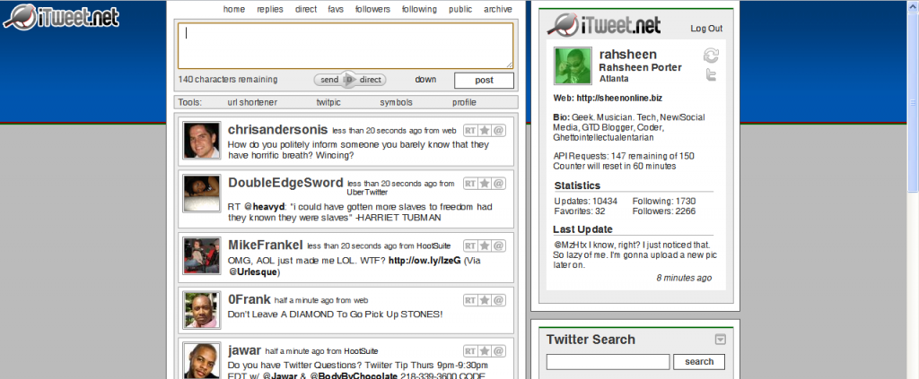
iTweet.net
iTweet.net is one of the first alternatives to the actual Twitter website that I ever used. Although I’ve moved on, it’s still an excellent site to use. The layout is similar to Twitter.com, but there are many advanced features under the hood if you so choose to use them. This is probably the simplest interface and good for those who don’t need a lot of bells and whistles.
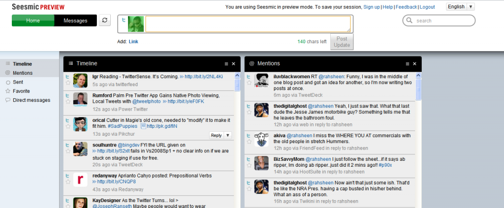
Seesmic Web
This one is still a preview release, which I assume means it’s not even in the alpha/beta stages. It’s pretty simple right now, but those used to the Seesmic Desktop may find the interface familiar. Check it out at Seesmic.com.
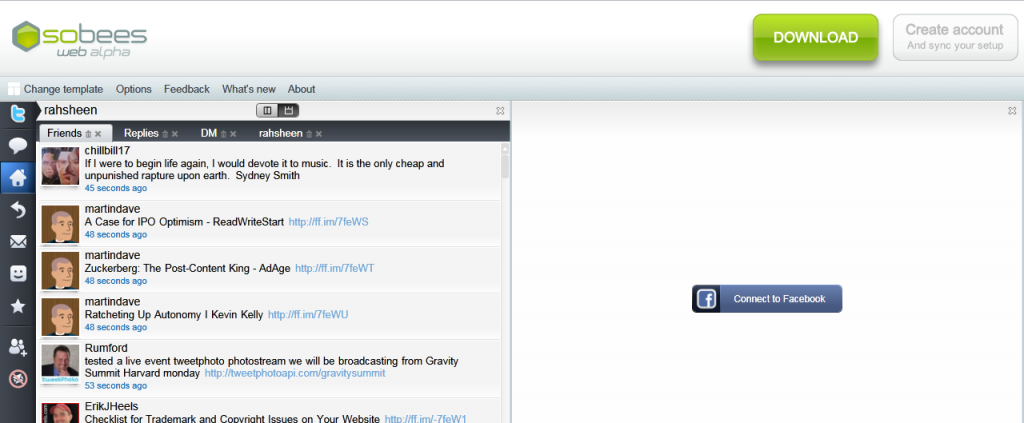
Sobees Web (alpha)
Sobees Web also sprouted from an existing desktop client of the same name. The interface is based on Silverlight and, I have to say, is quite nice to look at. It’s very flexible in letting you choose a layout and you can also connect it to Facebook. One issue I have with Sobees is the huge and unnecessary banner across the top that invites you to download the desktop client, as you can see in the screenshot.
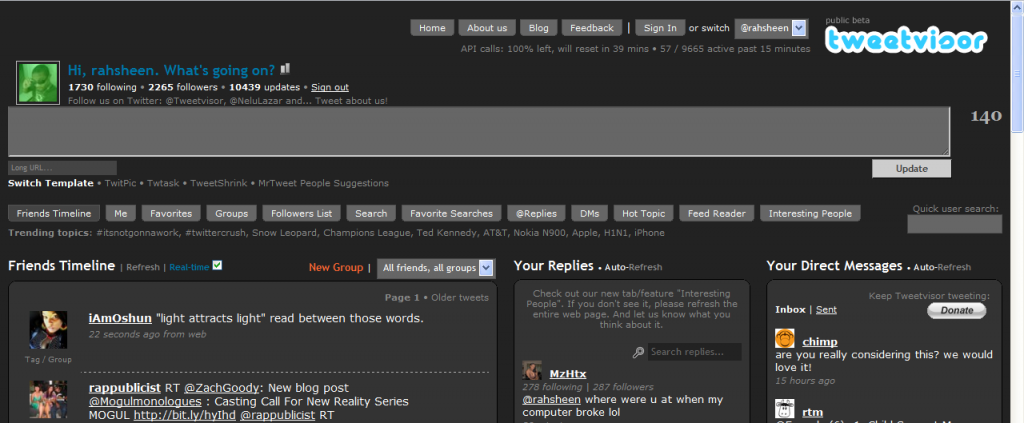
Tweetvisor
Tweetvisor is one of my favorite Twitter interfaces and also one of the most advanced. It packs a bunch of features that make Twitter so much easier to manage. It also embeds videos and photos right in the interface so you don’t have to click a bunch of links to see embedded media. It boasts a couple of different interfaces and also includes groups, which helps you keep up and categorize those you follow. Tweetvisor makes Twitter nicer.
PeopleBrowsr
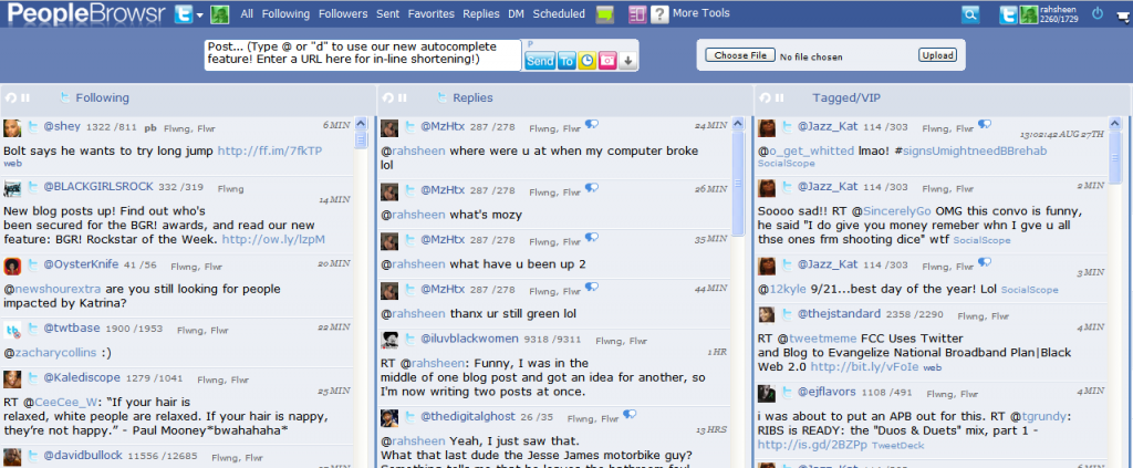
PeopleBrowsr also comes in as one of the most advanced Twitter interfaces. It also connects to pretty much all of your other social networks, including: MySpace, Facebook, Identica, and FriendFeed. It also includes advanced enterprise tools for managing your online brand. This is the interface I use currently. For the full breakdown, check out my post on getting started with PeopleBrowsr. There are a few reasons why I’ve settled on it, but the main ones are:
- Easily manage groups, including a VIP list of people. I currently follow 1729 people, but a fraction of those are VIP’s who I can follow in a separate column.
- Selective posting to multiple services. Not only can I post using Ping.fm within Peoplebrowsr, but I can also select from any of the services I’ve connected with.
- Scheduled updates and even repeated updates. This is a dangerous feature in the wrong hands, but I can schedule an update for a certain time, or schedule an update to be repeated at an interval. I primarily use this when I know I’ve been posting a lot, but still have something to say. I’ll schedule the post for a time in the near future and give my followers a break.
Do you use any of these services? How do they work for you? What web interfaces for Twitter have you come across that I’ve missed? Inquiring minds want to know.

![Reblog this post [with Zemanta]](http://img.zemanta.com/reblog_e.png?x-id=83e49147-6df5-4b41-8e67-8fdb0cd235cd)