Formula for Resizing Media to Fit Your Blog and Why You Need It

Even if the information on your blog is good, the sheer number of visible words can get overwhelming for some. It’s not really the word count that is the problem, it’s the wall-of-text that might turn off readers. The simplest way to break things up is to add images, video, and bullet lists. Adding media can be a pain, though. Here is a simple formula for finding the right width and height for embedding media on your blog or website.
Yo, dawg...

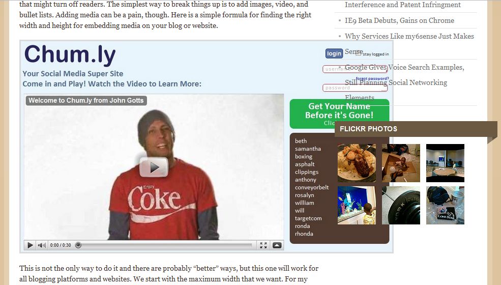
This is not the only way to do it and there are probably “better” ways, but this one will work for all blogging platforms and websites. We start with the maximum width that we want. For my blogs, it’s usually around 600px. This means that an image wider than 600px will overflow into my sidebar and make me look really unprofessional (see image above).

The Formula (Yes, it’s math)

The simple formula is based on proportions. Let’s say we have an image with a width w and a height h. We want to resize this image to a width of 605px, but we don’t know what the resulting height, x, will be we start with:

605/x = w/h

where x is the unknown height of the final image. Solving for x, we get:

x = 605*h/w

To use the formula for yourself, just replace “605” with the best width for your site, plug in the width and height for the media you’re trying to embed, and solve for x. Easy-peasy.

What to do with the results

Now that you know what width and height you should resize your media to, what do you do with it? In WordPress, the procedure is to insert the image into your post first. Go ahead and choose Full Size. Click your image and click the small photo to open up its properties. On the Advanced Settings tab, you will see where you can manually specify the width and height for the image.

Why?

While you can use the percentages and presets available in WordPress to scale down your images, it’s always a guessing game. I found that I was wasting a lot of time switching between playing with the percentages and checking Preview mode. Time is money and prettying up a blog post is probably not where you want to waste your money.

Was this helpful? Subscribe to my feed. Don’t forget to add your take in the comments.
Chum.ly Just Keeps Getting Better: Redesign and Feature Updates

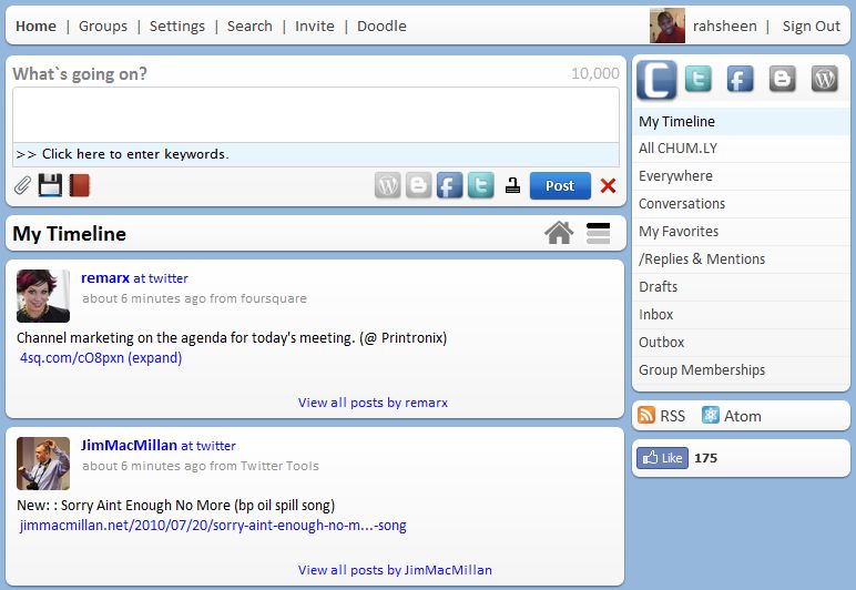
The Chum.ly team is staying on the grind and actively responding to feedback from their growing community. This has resulted in a complete redesign of the user interface, implementation of OAuth, and an upcoming iPhone application. I have to say, the UI update is a big difference from what they were working with a couple of weeks ago and OAuth makes it that much easier to jump in and see what Chum.ly can do.

Here is Chum.ly before the redesign:

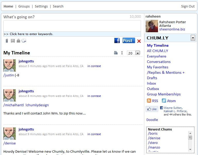
And here is the new interface:

The new interface is a lot easier on the eyes, but also makes more efficient use of space and is a little more intuitive for new users.

OAuth means you don’t have to give up your username and password for Buzz, Twitter, or Facebook. Just click a button and you authorize Chum.ly from the original site. This is a much more secure option and I applaud Chum.ly for getting it done about a day after my original post on Chum.ly.

Chum.ly no longer depends on third-party services like TweetPhoto, TwitVid, and TweetAudio to do rich media. They have moved to a simpler system where the handle media directly, eliminating the need for Chum.ly users to have a Twitter account. This is an important step in changing the perception from a Twitter or Facebook interface into a messaging platform in its own right.

Next up for Chum.ly is better integration of your Facebook account, much like what they’ve done with Twitter. There is also an iPhone app coming fast over the horizon, so keep an eye out for that. Chum.ly is definitely an advanced tool with a lot of power under the hood, but you really have to try it out to see what it can really do.

You can find me there.

Save Space In Your Sidebar with Tabbed Widgets

I am engaged in an ongoing battle with my blog’s sidebar. I’ve never been sure what I’d like to put over there or how I want it laid out. When I recently switched to Tarski, I decided to revisit my widgets (hey, I made a funny) and see what I could do to make things easier.

Let me give you a little background. I like hacking code. Doesn’t matter what kind of code it is or even whose code it is. On the flip side of that, I don’t like re-inventing the wheel or making things harder than they have to be. I have no problem digging into my WordPress plugins and themes and fiddling with the PHP code in order to bend it to my will, but if there is an easier way, I’m all for it.

The Quest For a Tabbed Interface

Tabbed interfaces are pretty popular. They let you squeeze lots of info into a small space and help your interface to look cleaner and simpler. I was originally using the Javascript tabifier to achieve this type of widget in my sidebar, displaying my Recent Posts, Popular Posts, and Disqus comments.

Continue reading “Save Space In Your Sidebar with Tabbed Widgets”

I Guess Video Embeds DO Work in WordPress

I originally got a video camera so that I could post videos of me singing on YouTube. Yeah, I know, lame.

Anyway, I more recently began using Seesmic for recording a workout journal because I find it extremely boring to write down or type what I have done. This information is imperative in making sure I’m progressing, though.

One day, I decided I was going to record myself reciting a verse to one of my songs spoken-word style. A lot of people seemed to enjoy this across the blogosphere. This got me interested in doing more video, so I started my 12 Seconds To A Better Life series on 12seconds.tv.

Until now, I had not embedded any videos here because I remembered running into issues before, but I can’t for the life of me remember now what had happened then because, as you can see below, Seesmic embeds just fine. It seems YouTube, Google Video and a few others need a plugin like Viper’s Video Quicktags.

The moral of the story is to always track what you do. Finding a solution to a problem is like solving a maze. If you don’t keep track of where you’ve been, you will keep hitting the same dead ends. I guess that applies to life in general, too.

Look forward to seeing more of me. The type of content here probably won’t change much, but video definitely allows for more diversity in how it will be presented.

Just for fun, here is me reciting something else on Seesmic.

Follow me at 12seconds.tv, Seesmic, or YouTube

Need an invite for 12seconds? Be one of the first 8 people to leave a comment and ask me for one.

Also, feel free to comment via Seesmic right on my blog 🙂

UBD Money Maker Theme and Expected Blog Content

Unique Blog Designs recently released the UDB MoneyMaker Theme, which I promptly installed and modified for my own evil desires. For some strange reason, it really caught my eye and I had to have it.

A quick list of things I hacked:

The funny thing here is that I had also decided that this wouldn’t be a Money Maker blog. I mean, how many of those can really succeed? I like money, I like making money, but I also like Social Media and Web 2.0 and those things are much more interesting to talk about for me.

To lay it all out there for you, my faithful reader, I will be blogging mostly about Social Media and Web 2.0 as they relate to self-improvement and increasing quality of life. There will be a focus on organization, motivation, marketing, and home business.

I can never stress enough how important it is to educate yourself, learn to use new tools and do new things. Once you have a base of “book smarts”, there is no telling where imagination can take you, and this is where success flows. I want to help others get there.

Make Sure Your Tweeps Know What The Bizness Is

I noticed I get a lot of Twitter updates regarding bloggers publishing new blog posts, so I figured there must be a WP pluging to do so. A quick search turned up Twitter Updater:

The Twitter Updater automatically sends a Twitter status update to your Twitter account when you create, publish, or edit your WordPress post. You can specify the text for the updates, and also have the option to turn the auto update on/off for the different post actions in the admin panel.

Follow the directions in the post and enter your Twitter username and password under ‘Manage->Twitter Updater’ in your admin panel. You will probably want to turn off updates for “New Post Created” and “New Post Edited” because those could result in some noise if you change your mind.

Read the full post here

Zemanta Pixie

Zemanta Made My Blog Fun Again…Kinda

Blog better using Zemanta

Image by chucks via Flickr

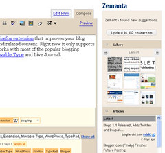
Zemanta is a plugin for Firefox (also for Flock) which suggests images and links to articles that you may wish to insert into your post. It has support for WordPress.com, Blogger.com, Typepad.com, and self-hosted WordPress installs v2.0 and up. The concept is awesome because this would make it much easier to provide more valuable content to your readers.

What’s Good?

As soon as you begin writing, Zemanta runs off and grabs items it thinks you may want to insert. These include: context links, images, tags, and links to other articles. All you have to do is click what you want from your sidebar and it’s automagically plopped into your content. All the content suggested is checked to make sure you don’t violate any copyrights.

I can’t stand filling in Tags for my blog posts. I always feel like I’m doing it wrong. But, as Jeff points out in a recent post, you should always tag your posts. Zemanta handles this for me, so I don’t have to think about it anymore. This is a huge plus if you are thinking about SEO.

Also, you can simply highlight a word (SEO above, for instance) and click the suggested link in Zemanta, and it makes the link for you. Pie and Cake.

What Kinda Sucks?

Zemanta uses a proprietary algorithm to figure out what you want. They do index your posts in order to improve their engine, but they say they won’t share with anyone outside the team. I could care less since I’m posting to a public blog.

Whenever you insert an image from the Gallery, you will be linking back to the source of the image (I’ve no clue who this “chucks” guy is, but I appreciate his photo). This could possibly be a concern for those who are trying to avoid sending user’s elsewhere. It could also affect your PR depending on who you ask.

Also, I’m not sure how many bloggers just randomly link to other blogs, so I’m not sure how useful this Articles feature is. I guess it all depends on how free you are with your link love.

There will also be links to Zemanta on items you insert, but you are free to remove them according to the Zemanta home page.

A lot of shady spammers may try and use Zemanta for evil. Don’t let this be you. Write original content and use Zemanta to take it up a notch.

Moral Of The Story?

Zemanta will allow you to easily take your posts to the next level by providing your readers with relevant images and links at the click of a button. Unless you enjoy hunting for these things on your own, you should definitely give it a shot.

WordPress 2.5.1 Migration and Redirect

So, I decided to go ahead and upgrade WordPress since I was tired of seeing the damned reminder in the admin area. In the process, I figured I might as well move WP to my top-level (if you recall, it was stored at /blog) and slap on a snazzy theme.

Still working on the “snazzy theme” part. I looked for hours while watching TV and just couldn’t find anything I liked all that much, so I just picked one.

Of course, now we are left with the problem of redirecting from /blog back to the root directory. A quick search on Google turned up this site, which gives you the code to do a proper permanent redirect with HTTP 301 in various languages. This will make sure that Google knows I moved and I don’t lose any Rank (as if I had any to begin with).

If you know where I can find a good theme site and not one that just recycles what’s already out there, let me know.